At AmazingPrint, we believe a t-shirt is so much more than a piece of clothing it’s a blank canvas for creativity, personality, and self-expression. A great t-shirt printing design can tell your story, showcase your style, and even spark conversations. As Virgil Abloh once said, graphic tees are one of the most powerful formats for designers and everyday people alike. And honestly, he’s right: no matter your age, style, or background, a well-designed t-shirt has the power to bring people together.
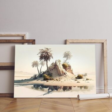
Best t-shirt printing design
Think about it, your closet probably already holds a mix of favorites: tees that feel like old friends, tees that make you laugh, tees that carry memories of special people or moments. At AmazingPrint, we know the magic of a t-shirt that just feels right. And that’s why we’re here to help you create designs that stand out, look professional, and become your customers’ go-to favorites.
But here’s the thing: not every design idea works perfectly when it comes to t-shirt printing. Without a few golden rules in mind, it’s easy to make mistakes that leave your audience less than impressed. Let’s walk through some of the most common pitfalls in t-shirt printing design and how you can avoid them to create prints that truly shine.

Centering Your Design in the Wrong Spot
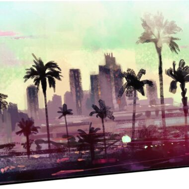
We get it if you want balance, so your first instinct might be to place your design smack dab in the middle. This is the first t-shirt printing design. The problem? That often puts your artwork right at belly level, and unless your shirt is making a joke about digestion, that’s not the look you’re aiming for.
Instead, position your design about 10 cm (or around 4 inches) below the collar. Of course, adjusting depending on the cut children’s t-shirts, crop tops, or tank tops all need a slightly different approach. This small adjustment can make your design instantly more flattering and eye-catching.
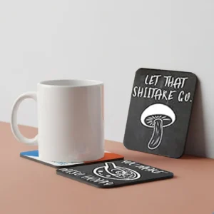
as ABYSTYLE Hunter x Hunter Kirua Ceramic Coffee Tea Mug
t-shirt printing design 2: Forgetting About Composition Balance
Every t-shirt printing design is a composition. You’re not just throwing elements together, you’re arranging text, images, and logos into a story your audience can “read” visually. To nail the balance:
Keep enough space between elements so everything is clear and easy to read.
Avoid spacing things too far apart otherwise, your design may look disconnected.
Place elements in a logical reading order so the message flows naturally.
And remember, sometimes you’ve been staring at your design too long to see it clearly. That’s when feedback from a friend, colleague, or even your family comes in handy. Fresh eyes often catch what you’ve missed. Also View: Battery Magic Mug Positive Energy Color Changing
Mistake 3 in t-shirt printing design: Overlooking Typography
Words can be just as powerful as images on a t-shirt. Think about the rise of slogan tees; they’re everywhere for a reason. A clever message paired with strong typography can make a design unforgettable. But only if the font is chosen carefully. Here are a few tips:
Pay attention to letter and line spacing so your text is easy to read.
If you’re using all caps, make sure the font is designed to handle it (skip overly decorative calligraphy fonts).
Stick to a maximum of two fonts per design, and make sure they complement each other like pairing serif with sans serif.
And yes, we have to say it: avoid Comic Sans at all costs. Seriously.
Typography might feel like a small detail, but it’s often the difference between a design that looks amateurish and one that feels polished and professional and customized gifts for occasions
Designing the perfect t-shirt is exciting but it’s also easy to get carried away. At AmazingPrint, we’ve seen it all: from oversized graphics to color explosions, and while creativity should always be celebrated, a little balance goes a long way. To help you avoid the most common pitfalls, here are more mistakes to steer clear of when working on your t-shirt printing design.
Mistake 4 in t-shirt printing design: Going Too Big with Your Design
There’s a saying that “bigger is better,” but when it comes to t-shirt printing design, that’s not always true. Oversized prints may sound bold, but they often throw off the harmony of the shirt and make it uncomfortable to wear especially if the fabric is thinner or if you’re designing for kids’ sizes.
Remember, every print adds a layer to the garment. Keep your design proportional so it feels natural, stylish, and wearable. A t-shirt should be something people reach for again and again, not a piece that feels stiff or awkward because of an oversized graphic.
Mistake 5: Using Every Color in the Rainbow
At AmazingPrint, we’re proud to offer DTG printing that can handle stunning color ranges. But just because you can use all the colors, doesn’t mean you should. The best designs often rely on just a few carefully chosen shades that work in harmony.
Stick to no more than 3-4 complementary colors for a polished look. And don’t forget to consider the shirt color itself your palette needs to match the fabric it’s printed on. This attention to detail will elevate your t-shirt printing design from “busy” to “brilliant.”
as 3D Diy Acrylic Mirror Wall Round Shape Stickers
Mistake 6 in t-shirt printing design: Ignoring Contrast
Contrast is what makes your design easy to see, read, and appreciate. Light text on a light shirt, for example, is a recipe for frustration. People will squint, and your message will get lost. Instead, pair light elements with dark backgrounds (and vice versa) for maximum readability.
Tools are available online to check color contrast, but even without them, trust your eyes: if you have to strain to read it on screen, it won’t work any better when printed on fabric. Strong contrast ensures your design pops and instantly catches attention.
Mistake 7 in T-Shirt Printing Design Tips: Keeping Distracting Backgrounds
Print-on-demand makes launching your brand simple, but that doesn’t mean you should settle for visuals with busy or unedited backgrounds. If you’re using photos or graphics, take the time to remove or clean up the backdrop.
Luckily, today’s tools make these super easy programs like Photoroom and Removal can clear backgrounds in just a click. By isolating your main subject, your t-shirt printing design will look sharper, more professional, and a lot more stylish.
Mistake 8: Over-Designing Your T-Shirt
When you have a million ideas, it’s tempting to squeeze them all onto one tee. But remember: the human eye can only focus on so much at once. Overcrowding a design with too many elements often makes it confusing and less appealing.
Instead, embrace simplicity. If you’ve got multiple ideas, spread them across different designs. Print-on-demand allows you to test and experiment risk-free, so why not let each concept breathe on its own?
Also read: Regular Printing vs. Print-on-Demand
Mistake 9: Misunderstanding the “Visual Center”
Here’s a secret: the true center of a design isn’t always the geometric middle. The visual center is where the eye naturally lands first, and placing your design with this in mind makes it look balanced and intentional.
Thankfully, there are tools to help you find that sweet spot simply upload your design, and you’ll see where the focal point really lies. Aligning with the visual center ensures your final t-shirt printing design feels right to anyone who sees (or wears) it.